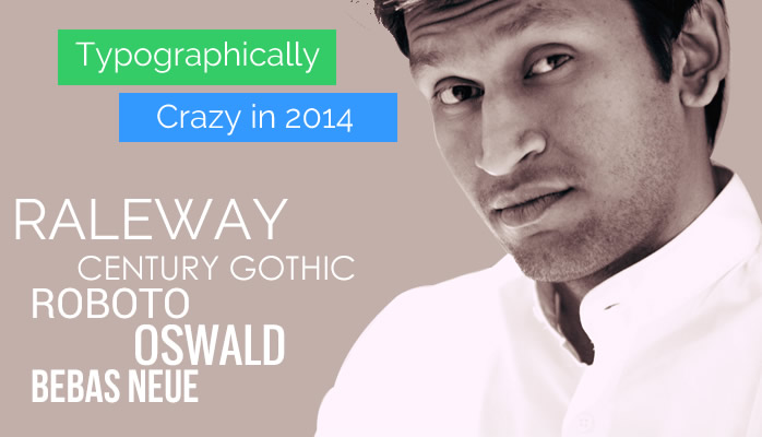
I never thought I would go crazy about typography one day, this love affair with typography started few months back and has been going on ever since. So, as they say – “Sharing is Caring”, following are the 5 fonts that are my personal favorites in typography fonts:
- Raleway: Oh My God I am in Love with this one! Simply elegant, will compliment with your morning tracks or even your partying wardrobe. It is the perfect suit for business professional print graphics or web. Also looks super elegant in E-Commerce if used with correct weight. That said, I wouldn’t recommend this one if density of words is quite high.
- Century Gothic: There are some typography fonts which are like “One Night Stands” but this one is like a wife which never betrays (I hope you are in healthy relationship with your wife ;)) Use it in any kind of graphics or website, if used appropriately with correct font size gives a super look to your model.
- Bebas Neue: Do you think you can make a great graphic for web without the use of Photoshop and only typography? Trust me you can if you can make the best use of colors and fonts, and this font is my personal favorite when I want to state facts and numbers. Very clean and straightforward, with a hint of warmth, guiding you straight to the heaven of Design!
- Oswald: As you may know from personal and other people’s experience, a combination of hot and intelligent girlfriend is always difficult. Typography fonts are quite similar. Oswald looks best on digital platforms and web devices but not so good with print media. Highly recommended for the web environment, but not so much for print.
- Roboto: Who doesn’t love curves! This is a font with a force to reckon with, but with a hint of flow of curves. If I could relate this one to a human, it would be a schoolteacher who is very strict but always has some sweetness and your best interests round the corner. This one works really well with PowerPoint presentations and other graphics where you need to emphasize on the rhythm of reading.
So these are my typography preferences. What are yours?